
This page last updated 5/16/14
Ink is a fascinating part of fountain pen use and many seem to be on the quest for the perfect ink. The following contains some random thoughts on the inks we carry and ink properties in general. We get asked a lot of questions about ink and we hope this section on inks will answer many of those questions and help you on your quest for your perfect ink!
PLEASE NOTE: This page is truly a work in progress and something we do just because we love inks as much as you do! We have pages and pages of handwritten notes on inks that eventually will make their way here. We're still working on getting our thoughts and ramblings on all of the different brands we carry from paper to website. We're at 400+ different colors of ink and counting as of April 2008, up about 200 inks from July 2006 when we started this little section. Seems like more are being introduced all the time! Mainly this is a page we do for fun and love of ink, and unfortunately we don't get quite as much time to work on it as we would like. Not that it is unimportant, but there are just an awful lot of other pages on the site that take priority over it. Thanks for your understanding!
Color Variances
Ink colors can vary greatly due to several factors. The width of the nib you use affects color perception - broad nibs put down a much more colorful line of ink than a fine nibbed pen because you *see* more ink on the paper. White paper will make colors appear the truest, ivory or other colored paper may make the ink appear differently. Also, different papers may absorb ink better than others resulting in color variance.
Paper and Feathering
There are a wide range of papers available in the world today. Fountain pens can be very persnickety about which paper they perform best on. Most expensive does not necessarily equate to better paper for fountain pen writing. Ink may feather on paper for several reasons including the humidity level in your particular geographic area. The moisture can draw ink further into a piece of paper thus causing feathering. Broad or wet writing pens may be more prone to feathering. Certain inks seem to agree better with certain papers for no obvious rhyme or reason. The bottom line is you are going to have to experiment a little to find which of your pens and inks are compatible with which paper. We offer a wide variety of fountain pen friendly stationery and papers including Clairefontaine, a favorite of many.
Fountain Pen Ink Permanency
One of the questions we are asked most frequently is which of the inks we carry are waterproof. NO fountain pen inks are waterproof or permanent. They are ALL water based inks, as they must be in order to work properly in your fountain pen. Some inks have more water resistancy than others, but none of them are permanent. Many older inks, especially Sheaffer Skrip and Parker Quink inks from the 1930s - 1950s indicated on their labels whether they were washable or permanent. This does not apply to their permanency on paper, but to how easily they would wash out of clothing. We carry Pelikan Fount-India inks which are safe for fountain pens and exceptionally water resistant.
HINT: If you're concerned that envelopes addressed in fountain pen ink might get wet and the address smeared, try rubbing a plain white candle over the address area. You can't see this and the address is protected.
PLEASE NOTE - Some of the above info on permanency has changed a little bit due to the research and efforts of The Noodler's Ink Company. We now have available truly permanent (still water based) fountain pen inks that employ cellulose reactive dyes. These dyes are completely water soluble in your pens and in the bottle, but the cellulose reactive dyes react with the paper and when dry are totally waterproof and permanent. Great invention! All three of our Pendemonium Exclusive colors have the "bulletproof" designation.
What is Fountain Pen Ink?
Fountain Pen ink is composed of water, dye and surfactant, a detergent based agent used to help control flow in your pen. NOTE: Drawing and drafting inks contain shellac which can be harmful to your fountain pens. There are also several inks out on the market marked Calligraphy Ink and further marked for use in fountain pens. We suggest you check these carefully, we've found most of the Calligraphy Inks to contain shellac and unsafe for fountain pens. Never use any ink other than those made specifically for fountain pens in your pen. If in doubt about a particular ink, feel free to contact us.
Inks & Pens Can be Quirky!
Not all pens and inks are created equally! Sometimes it takes a little experimenting to find the right pen-ink combo, you know what I'm talking about - the perfect flow and color in just the right pen. So remember a few basics because to achieve this you need to remember that this is a little bit of science with a lot of common sense thrown in. Don't panic if Ink A doesn't flow the same as Ink B in your favorite pen, clean out your pen, go back to Ink A or try another ink and put Ink B in a different pen! Did ya'll follow that?
*** Not all inks work equally in all pens ***
Each ink, even inks of the same brand, are formulated just a little differently from each other. Same goes for fountain pens - each one is a little different. Even two fountain pens exactly the same can behave vastly differently. Fountain pens are not like ballpoints, they require lots of TLC and some maintenance just like your car. Always remember to clean your pen with room temp water (NOT hot water & NO chemicals) when you change inks, it's a good idea to do this every few weeks even when you're not changing inks just to keep them up to snuff!
Cartridge vs. Converter
In many modern day fountain pens you have an option of using an ink cartridge or a converter. Cartridges can be very convenient to use since all you have to do is plug one in. However, I recommend you use bottled ink whenever possible and even if you're hopelessly addicted to cartridges, try to use a few converters full of ink from time to time. When you use a cartridge ink flows only OUT of the pen, but when you use a converter and bottled ink, ink is pulled INTO the pen as well as pushed OUT of the pen - this offers some small measure of cleaning action and helps to keep pens flowing properly.
Ink Staining and Dyes
Just a few comments on ink staining in pens. Inks contain dye and dyes can stain. Red, violet and pink inks (red dye) will be more prone to staining than most colors. We suggest you give some thought prior to using the red dye based inks in clear or translucent pens. Blue inks are generally least apt to stain.
Pigments - There are NO pigments in Fountain Pen Inks! Just a pet peeve of mine - fountain pen inks contain dyes, but not pigments!
Ink Removal
My fingers tend to get pretty inky over the course of the day and since it's my full time job to fiddle with pens and inks, inky fingers don't bother me much. But, I know that many of you prefer clean fingers. All sorts of thinks will remove ink from your skin: bleach, pumice stone and heavy duty soaps. I find that shampoo works splendidly, it's rare that I still have inky fingers after shampooing my hands.
Removing ink from clothing and other fabrics can usually be done quite handily with Amodex. It is best not to tamper with the stain first - let it sit and then use Amodex followed by normal laundering. Oxyclean type products can also be useful in removing ink stains.
Ink Mixing
Many people enjoy mixing inks to find unique and unusual colors. 99% of the time different colors and different brands of inks mix together perfectly with no ill affects. However, we advise you to mix in small batches initially since every now and then two inks can react poorly with each other creating an undesirable sludge! Also, best to mix by drops initially, since a small amount of color can make a big difference! Try to keep track of your measurements ratios so when you end up with the color you're after, you'll remember how to mix it the same way in the future. Small batches also mean you'll waste less ink as you experiment and I can almost guarantee you will come up with some ugly ones along the way!
The www.handprint.com website has extensive information on color mixing, color wheels and complementary colors, all of which are the basics for how to make new colors successfully!
Gunk in your Ink
ACK! There is something in my ink that shouldn't be there! Ink doesn't cost very much, compared to the price of your pen. If there is something floating in your ink or something stringy for that matter anything other than just plain 'ol ink, we suggest you flush that ink bottle.
Old Inks in Your Pens
Many people ask us if they should use old ink and we believe this is another one of those common sense issues! We use 50+ year old ink frequently in new fountain pens and vintage fountain pens with excellent results. Before using old inks, you need to take a few precautions.
Vintage Ink Precautions:
1. Check to make sure there is no sediment, mold or other non-ink substance floating around or in the bottom of the bottle. Solids don't flow well, keep them in the bottle and out of your pens.
2. Look at the color of the ink, if it has taken on an odd hue that just doesn't look right - keep the ink in the bottle.
3. Unscrew the lid and take a little sniff, if you notice any unusual odor, screw the lid back on and refrain from using the ink.
Vintage Blue and Blue-Black Inks
These seem to have survived the years better than other colors of inks and are a pretty good place to start if you're looking to try vintage inks. Older Sheaffer Skrip, Parker Quink and Carter's Inks are generally pretty stable inks and we've had good results using these.
Never, never, ever use Drafting, Drawing or India Inks
in a fountain pen - these contain shellac which can gum up the insides of a fountain pen quickly. Early iron gall based inks can also be very corrosive to a fountain pen and I urge that you try them out with a dip pen or glass pen instead of a fountain pen.MYTH: From time to time people are told that they should buy a fresh bottle of ink at least once a year and that ink only lasts a year. This is nonsense! As long as your bottle of ink looks and smells good, keep using it, no need to toss out perfectly good ink.
Ink Reviews:We have listed below many of the fountain pen inks that we presently carry in stock. We feel all of these inks are "safe" inks for your pens, unless otherwise noted. The color reviews are strictly our personal opinions!
A.T. Cross Ink
A.T. Cross inks are currently made by Pelikan. They are the EXACT same inks as Pelikan, just in a different labeled bottle. We do not carry Cross labeled bottled inks since they're the same as Pelikan and the Pelikan bottles are a bit less expensive than the Cross.
Italian made Aurora ink wins the prize for the smoothest flowing ink I've used. Note that the Aurora ink is bottled in a rather tall vertical shaped bottle which some people fear is easy to tip over. I rather like the bottle because it is easy to dip a large nib into.
Black - A tie with Pelikan Brilliant Black for the deepest, darkest most opaque black ink available today. I think the Aurora ink is one of, if not the, smoothest to write with. My favorite black ink!
Blue - A very rich deep blue with just a little hint of violet lurking in the background. As with the black, very smooth flowing.
Bexley Inks are made by Private Reserve - it's the exact same ink, in the exact same bottle!
Bexley Ink Name
Ocean Blue............................
Mountain Violet.....................
Midnight Black......................
Harmony Green.....................
Turquoise..............................
Mocha..................................
Lapis Blue ............................Private Reserve Ink Name
Lake Placid Blue
Plum
Velvet Black
Sherwood Green
Naples Blue
Copper Burst
Tanzanite
Caran d'Ache Ink
Amazon - This is one of those mysterious inks! It's a darker green, leaning toward the Hunter green range, but it also pops out on the page nicely, plus a bit of two tone shading. Very aptly named, after all, the Amazon is a multi hued green, right?
Blue Night - A blue-black ink. Some blue-blacks show hints of green, I detect none in the Caran d'Ache. When dry, there is a hint of grey, typical of blue-black inks. Nice with flexible nibbed pens, shows some shading.
Blue Sky - Similar to many European royal blue inks, this is not an intense color, but a true blue with some translucency to it. Like the Blue Night, there are nice shading affects when using a flexxy fountain pen.
Carbon - A very dark black with just a hint of transparency to it, not totally opaque, but certainly not washed out either. I'd say it's about an 8 on the black scale with 10 being the very darkest.
Caribbean Sea - I love this color! But then, I'm fond of turquoise hues! This is an intense turquoise, a little more green than blue, but not overly so.
Grand Canyon - This is an interesting brown. Lots of shading when writing which is nice. It has a hint of grey in it. It's a mid-range brown, not too light (definitely not a tan), not too dark - you know it's a brown, it doesn't fade to black.
Saffron - An intense orange, definitely works for Halloween!
Storm - Dark purple, not too much red, not too much blue, it almost qualifies as a burgundy on the purple end of the spectrum. I think of dark grey skies when I think of Storms, but perhaps somewhere in the world they have purple storms!
Sunset - Bright, intense red and quite the true red. You'll like this for Valentine's Day!
Conway Stewart Ink
Conway Stewart inks are smooth flowing, medium-hued inks, not washed out at all, but not super bright either, with perhaps the exception of Blue as noted below.
Black - Not the darkest of the blacks, but certainly not washed out, I'd give it an 8 out of 10 on the blackness scale.
Blue - Conway Stewart's blue is a rich vibrant royal blue, nice standout color for signatures or when you want a bright, but not flashy blue.
Brown - Medium brown with hints of copper highlights.
Conway Stewart Green - A lovely deep conservative hunter green.
Green - Medium green, think of this one as a slightly softer, less harsh holiday green.
Red - Pretty pure red, not orangey, a good choice for those Valentines.
Turquoise - Like Conway Stewart green, the turquoise has a "softness" to it, but is not washed out and definitely not an aqua or pale azure. Nice standout turquoise with just the right mix of blue and green.
Violet - Leaning toward the red end of the violet/purple spectrum, but not too much! Qualifies in my book as a nice royal purple.
Delta Ink
Aside from the fact that these are even flowing Italian inks, one of my favorite things about Delta is the lid they use on their bottle! A strong stainless steel screw on lid with rubber gasket - I haven't seen one leak yet.
Black - Not the darkest of the blacks, but not washed out either, I'd give it an 8 out of 10 on the blackness scale.
Blue - Beautiful rich vibrant royal blue and a good choice for a standout signature.
Brown - Medium brown with hints of coppery highlights.
Green - Dark, dignified hunter or forest green color.
Orange - Why Delta named this ink Orange is beyond me, not orange at all! However, it is a lovely shade of dark yellow that shows up on paper better than most yellow fountain pen inks.
Red - One of the purer reds, not orangey, not pinky.
Diamine Ink
Diamine is also the manufacturer of Yard-o-Led inks, and we chose to carry Diamine Old English Writing Inks - bigger bottle, better value! Most colors available in bottles and cartridges. See our notes under Yard-o-Led inks for the Diamine matches to those colors.
Diamine separates their inks into Old English Writing Inks and New Century Inks. The New Century inks are, according to Diamine, brighter, more modern colors and they come in a different color box. However there are some pretty vibrant colors in the Old English lineup, too! Both inks are same formulation. For ease of looking up a color, they're in alphabetical order by name, below.
Amaranth - Introduced in 2008, a purplish-red burgundy color that is hard to describe in text. Darker than those holiday reds.
Amber - A dark caramel color, easy to read on paper, slightly translucent.
Aqua Blue - A pastel turquoise, but not washed out and easy to read on paper.
Black - Has a bit of transparency to it, but still definitely black and not grey, I give it a 7 out of 10 on the blackness scale.
Blaze Orange - Not a Halloween orange and not quite as autumn looking as Private Reserve Orange Crush, but it does fall into that just slightly subdued range or orange. A good Fall color.
Blue Black - An old-antique type look to this blue-black, nice shading and two toning affects, especially with flexible nibbed pens.
Brilliant Red - A deep red, no orange and very close to being a pure red.
Burnt Sienna - Introduced in 2008, very reddish-brown, but not quite a terracotta color
Cerise - The name cerise makes me think of pink, but this is a clear red with just a hint of magenta.
China Blue - Introduced in 2008, a soft medium blue, no red or purple tones
Claret - A pinkish red, very pretty.
Coral - Introduced in 2008, a sort of light salmon color with some pink in the mix, it's coral! Bright, but not too bright.
Crimson Red - Clearly red, and near the holiday reds, but just a little darker.
Dark Brown - The name of this one might be a little deceptive, it isn't light brown, but doesn't really qualify as dark brown either, has some yellow tones to it.
Dark Green - Just a hint of yellow and a bit of complexity, Qualifies as a good conservative green, not bright holiday green, but not as dark going toward black as some of the other hunter or forest type greens available. Think of it as a medium-dark green!
Deep Magenta - Somewhat similar to Private Reserve's Plum, a nice pinkish-purple, unusual color.
Emerald Green - Darker forest or hunter green color, not bright like emerald jewels.
Florida Blue - Formerly Tropical below, re-introduced as regular production ink in 2008 by popular demand. This is a great color! See description under Tropical Blue, please!
Golden Brown - Brown with heavy yellow highlights.
Grey - Soft, soft black, darker than the J. Herbin Grise Nuage and lighter than the Private Reserve Gray Flannel.
Imperial Purple - Very similar to Waterman and Pelikan purples and a good royal purple with slight red tones.
Indigo - Greyish-blue, still definitely blue, but leaning toward those grey tones. This was one of the top four Diamine inks in our exclusive test market in 2004!
Jade Green - Jade green has the look of what I think of Asian Jade - a soft not too dark green, very nice color and not similar to any other green.
Light Green - Beautiful pale green, but not translucent or washed out at all, great spring color.
Maroon - Very dark red with quite a bit of brown in it, sort of a muddy red color.
Monaco Red - A delightful and unusual shade of reddish-burgundy.
Mediterranean Blue - Turquoise, heavy in the blue range.
Orange - A couple of shades darker than a bright Halloween orange, a wonderful autumn ink. This was one of the top four Diamine inks in our exclusive test market in 2004!
Passion Red - Catches your eye right a way, very bright red with a little undertone of pink.
Pink - A rosy pink, not washed out at all and not translucent like some pinks. Very pretty.
Pink Flamingo - Bright hot pink, yes it looks like a pink Flamingo!
Prussian Blue - Similar to Pelikan Royal Blue, but a little more intense. Not a bright cobalt, more subdued and conservative. This was one of the top four Diamine inks in our exclusive test market in 2004!
Quartz Black - We compared the Quartz Black to Diamine's Jet Black and found it just a little warmer, a hint of brown making it a very nice eye appealing color.
Raw Sienna - Introduced in 2008, medium brown, lots of yellow tones, falls into the sepia category with an old fashioned look.
Registrar's Ink - Diamine calls it Blue, but it is quite dark with heavy leanings toward blue-black, very traditional ink color and used by Registrars in England for official signings. Permanent. Heavy in iron gall content. If you use this ink, be sure to wash your pen more frequently than with other fountain pen inks.
Royal Blue - Pure, true blue, slightly translucent.
Saddle Brown - Introduced in 2008, darker than most Diamine browns, but still not a super dark brown ink, hints of red undertones, shows some two tone effects in flex pens.
Sapphire Blue - As the name says this is a bright Sapphire and a beautiful color with a bit of translucency to it.
Scarlet - Very deep pink, but with heavy red tones instead of violet tones. Close in color to the J. Herbin Rose Cyclamen, but not as translucent, offers good coverage.
Sepia - Nice antique look to this medium shade of brown.
Steel Blue - Teal! A pure teal without any greenish overcast. The name of this color I mentally equate to a grey blue, but not the case at all with this ink. This was one of the top four Diamine inks in our exclusive test market in 2004!
Sunshine Yellow - Soft yellow, fairly saturated and could be used as a highlighting ink, but still a bit tough to see in fine and medium pointed pens as so many yellows are.
Turquoise - A tad lighter than some other turquoises, nice even mix of blue and green.
Umber - Introduced in 2008, mot people think of umber in the brown family, but it is a dark green, in the avocado color range rather than the deep, dark green range. A little darker than your average run of the mill green olive!
Vermilion - Introduced in 2008, bright, vibrant orange, like artist's vermilion colors. Jumps off the page!
Violet - Purple, but with some blue so that it appears darker than some other violets.
Washable Blue - Introduced in 2008, one might think it boring with a name like Washable Blue which isn't as exciting as most Diamine Ink names, but it is a vivid medium blue, very true blue look. Not pale or washed out at all.
WES Imperial Blue - Introduced in 2007 as a special edition ink sold by the Writing Equipment Society of England. Ink is now in regular production. A nice deep blue, hint of subtle violet tones, nice stand out blue.
Woodland Green - Darker green, more conservative, no blue tones, think Forest or hunter type greens.
Yellow - Bright, pure yellow, good for mixing as most yellow inks are. Not as good used by itself unless with a broad nib on white paper.
Diamine Limited Edition Inks
The Limited Edition Inks are limited to 1,000 bottles per color. Each is individually numbered, and in a special limited edition box.
Presidential Blue - Introduced in 2004 as a limited edition ink of 1000 bottles. Re-introduced in 2008 as a regular production ink due to popular demand! A crisp, dark blue, not bright cobalt, not quite a blue-black.
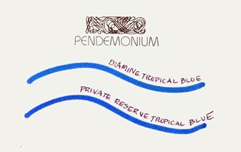
Tropical Blue - Introduced in 2004 as a limited edition of 1000 bottles. Re-introduced in 2008 by Diamine as Florida Blue - A gorgeous deep aquamarine, not turquoise, a pure blue. We are sold out of this Limited Edition ink. Hint: Private Reserve Tropical Blue is an exact match for this color!
Duke Ink
A spectacular bottle! Looks great sitting on your desk and has a lid that tightens down well - the kind you push and turn, sort of like the childproof meds bottles, but much easier to open! I have fits with those childproof caps
. The inks are very free flowing and no clogging reports at all. Only two colors available, but both are nice! Black - Dark, opaque black. Not a wishy-washy greyish black at all.
Blue-Black - Very dark, but definitely more blue than black. No two tone affect though like other blue-blacks.
J. Herbin Ink
J. Herbin of France has been continually manufacturing ink since 1670 and as far as I can tell is the oldest ink manufacturer in the world! J. Herbin uses all natural dyes in their fountain pen inks. Scented inks are safe for fountain pens, scents are derived from a synthetic source. Perfumed inks (which we do NOT carry) are not safe for fountain pens, perfumed inks contain oil which should never come in contact with your fountain pen. Metallic inks, white opaque ink, invisible ink and specialty dipping inks noted on the website should only be used with a dip pen or glass pen, do not use in your fountain pen.
J. Herbin Fountain Pen Inks
Ambre de Birmanie - Lovely shade of amber.
Bleu Azure - Pale sky blue color, suggest using this in a medium-broad or larger nibbed pen on white paper for it to show well.
Bleu Myosotis - Nice medium shade of blue.
Bleu Nuit - Very deep, deep blue with just a hint of violet.
Bleu Pervenche - Beautiful shade of turquoise.
Bouquet d'Antan - A soft mauve/pink just a little bit lighter than Private Reserve's Shell Pink.
Cacao du Bresil - Chocolate brown, bit darker than the standard Cafe des Iles Herbin offers.
Cafe des Iles - A softer shade of brown, has an old, antique look to it, especially on ivory papers.
Diabolo Menthe - Creme de menthe, frothy soft pastel green. A bit greener than the Private Reserve Foam Green.
Eclat de Saphir - Medium blue, a bit brighter than the Herbin Bleu Myosotis, not quite as bright as Waterman Florida Blue.
Grise Nuage - This is my personal favorite grey ink, not washed out black, but a true grey.
Jaune Bouton d'or - A very faint shade of yellow, recommended for broad nibbed pens on white paper to be visible. Most people use this ink for mixing.
Larmes de Cassis - (introduced March 2008) A rich burgundy with heavy purple undertones. This color is a little lighter than everyone's beloved Sheaffer burgundy, but falls into the same color range.
Lie de The - A nice chocolate brown, very similar to Waterman Havana.
Lierre Sauvage - Dark forest green.
Opera Red - Opera Red is a scented version of Rouge Fuschia.
Orange Indien - What can I say, this is bright orange ink - think Halloween!
Perles des Encres - Dark black, but remember that Herbin inks are thinner inks, so this color will pick up more grey tones than some other black inks.
Poussiere de Lune - Burgundy with heavy grey undertones.
Rose Cyclamen - not for the weak of heart, Rose Cyclamen is magenta!
Rouge Bourgogne - (introduced March 2008) A strong red, just a hint of underlying pink.
Rouge Caroubier - This is one of the reds we recommend as a "true red".
Rouge Fuschia - Very nice darker shade of red, almost a burgundy, but not quite.
Rouille D'Ancre - (introduced March 2008) This color is hard to describe! It is brown, but an unusual one with lots of pink in it, lots of two tone effects. The underlying pinks do not make it look feminine, it's still a brown ink!
Rose Tendresse - A nice bright pure pink, not as bright as the Rose Cyclamen, but more of a true pink.
Terre de Feu - A soft shade of terracotta, haven't seen another ink color quite like it.
Vert Empire - (introduced March 2008) A beautiful dark green, barely a hint of blue in it. I think of it as a Forest Green, but not as dark as some that fall in this category.
Vert Olive - Just as the name says, imagine a green olive and you'll know exactly what shade of green this is.
Vert Pre - Springy color, almost a "lime green".
Vert Reseda - A medium shade of green with bluish tints, but not enough to make it turquoise or teal. Softer color than what you might consider a Christmas green.
Violette Pensee - Beautiful shade of rich purple.
J. Herbin Dipping Inks
Encre Authentique - A dark black, very permanent dipping ink traditionally used for signing important official documents.
Gold, Silver & White inks - These are opaque inks that should not be used in fountain pens. The Gold and Silver contain actual metallic pigments and are very rich looking. The gold, silver and white inks need to be shaken frequently in their bottles while using, the pigments settle quickly.
India Ink (Encre de Chine) - As black as ink comes! Very shiny with a high concentration of lacquer.. For traditional pen and ink lettering and illlustration using a dip pen. This ink will clog a foutain pen in no time flat!
Invisible Ink - Looks pink in the bottle, but goes down clear. When you hold a letter written with this ink under a light bulb or other heat source, the writing will appear. Rather fun and mysterious! NOT for fountain pen use!
Louis XIV - Bright royal blue dipping ink. Sorry, this ink is no longer distributed in the US.
Victor Hugo - Opaque black ink is very black - for dipping only. Sorry, this ink is no longer distributed in the US.
Lamy Ink
Lamy inks are made in Germany. The inks are very nice, but the best part may be the bottle they come in! Sturdy, wide bottom to prevent spills, the interior of the bottle is cone shaped so there is a well to help you get more ink of the bottle and into your pen. Plus there is a roll of blotting paper in the base of the bottle, very handy! Leave it to Lamy to be innovative not only in pen design, but ink bottle design, too.
Black - Not wishy-washy, also not the deepest darkest black, I'd rank it an 8 out of 10 on the black ink scale.
Blue - A dark blue, not quite navy or midnight blue, but darker than many blues.
Blue Black - This is navy or midnight, very saturated dark blue. As is typical of many German inks, Lamy Blue Black has some iron gall content, not enough to harm your pens, but it does add a tiny bit of water resistance.
Green - Bright, bright, bright pure shade of green.
Red - Also quite bright with lots of orange in it. Not quite as orange-y as Pelikan, but close (maybe this leaning toward orange is a German thing?).
Turquoise - I think of this as a true turquoise, not too blue, not too green.
Violet - Violet is available in cartridges only - NO bottles of violet! It is a rich, royal purple.
Namiki Ink (aka Pilot)
Very smooth flowing inks and they come in a cool bottle, too!
Black - I'd rank this at about 8 out of 10 on the blackness scale.
Blue - Beautiful true blue - close to Waterman Florida Blue.
In addition to Namiki's bottled blue and black inks, they have some additional colors that are only available in cartridge form.
Blue Black - Very dark blue black, no greyish tints like some.
Green - Darker green, not quite a forest green, but not a bright holiday green either.
Light Blue - When I see "light" I think pastel, but not true at all in this case. Namiki's Light Blue is similar to Parker Quink blue, not as saturated as Namiki Blue in the bottle.
Purple - A light shade of purple, not quite lavender, but heavier on blue than red tones.
Red - A fairly pure red, but not as bright and brash as Waterman or Quink reds, think of it as a just slightly subdued holiday red.
Mixable Color Cartridges - Pilot offers an assorted pack of 12 cartridges noted as Mixable Colors, these are specially formulated for Pilot Parallel pens and not recommended for normal Pilot/Namiki fountain pens.
Everyone loves the Noodler's Ink! Click here to read some info about the company, the inks and just how innovative this company is. Below are some of our thoughts and some details to help you figure out which Noodler's colors are for you.
"Regular" Noodler's Inks
The inks listed below are far from "regular", but we had to subdivide the Noodler's categories somehow! Regular refers to Noodler's traditional water-based fountain pen inks. They are NOT bulletproof. There is a wide array of wild colors and you get a lot of bang for your buck with a 90ml bottle of Noodler's!
Antietam - Orangey-red, quite bright.
Apache Sunset - Yellow-Orange color. dark enough to see on paper, unusual shade not quite like any other ink we have come across.
Army Green - Looks like a green olive, perhaps a tad lighter. Much lighter than US military army green, not a "camo" color.
Baystate Blue - (introduced February 2008) Undoubtedly THE brightest, bluest ink Noodler's has created yet! Based on the color of Colonial Blue Ink made in the mid-1940s. Baystate Blue is a little different from most of the other Noodler's inks - It is NOT bulletproof, but does have a high degree of water resistance. It is NOT pH Neutral like all other Noodler's Inks. Ph is 8-9 range. It is suggested that you do NOT mix this ink with other inks. Baystate Blue is also much more prone to staining than other Noodler's inks which tend to rinse well, especially bulletproof ones.
Beaver - A reddish-brown color.
Blue - Lovely, true blue, along the lines of a cobalt blue. Similar in hue to Private Reserve's Lake Placid, but does not appear as dye saturated, an excellent signature blue.
Burgundy - A red toned burgundy, no purple hues. In fact it starts to approach a brick red color.
Cayenne - Bright, bright orange! Makes a great Halloween ink.
Concord Bream - A very nice lavendar, not dark purple, not too light either.
Dragon's Napalm - It looks like Mercurochrome! That funky red/orange/pink colored stuff your Mom used to put on your cuts! Heavy applications used with a brush instead of in your pen will produce interesting sepia shaded highlights.
Forest Green - Conservative, dark green
Gruene Cactus - A lighter, but quite bright green.
Habanero - A shade lighter than Noodler's Cayenne, but still a bright, true orange.
La Couleur Royale - Dark blue with a hint of violet. Reminds me of Private Reserve's Tanzanite, but not quite as dark and a little more purple.
Midnight Blue - Very dark blue, not quite what we might think of as navy blue, but coming close.
Navajo Turquoise - Think of the southwest American Indian turquoise jewelry - a very beautiful color - more blue than green.
Nightshade - An extremely deep dark red-purple color that sometimes appears nearly black depending on the light it is viewed in.
Nikita - This bright fire engine red ink spoofs former Russian Premier Nikita Kruschev - definitely a collectible label! If you want your writing to stand out, this does the trick with it's bright color. It is a very true red, no orange, no pink involved.
Ottoman Azure - This is a true blue! Little bit bluer than Noodler's Blue but has more clarity to it.
Ottoman Rose - A reddish-magenta, Not quite pink, but not a red either, a stand-out color - it is bright!
Purple - Subdued purple! Definitely purple but not quite as vibrant as Herbin Violette Pensee or Waterman Violet. Heavier on blue than red tones.
Purple Martin - Rich, dark purple, not too blue, not too red. Darker than most purples, but sill obviously purple at first glance, there is no mistaking it as black in any kind of light.
Purple Wampum - Definitely saturated purple and starting to approach the old Sheaffer burgundy color which wasn't all muddied up with browns. The Wampum has more red than the Noodlers Purple and Purple Martin, but just enough so that it is still definitely purple and not a red-violet.
Red - Bright enough to be a holiday red, no orange tones, not quite as true red as Parker Quink red or Waterman red.
Saguaro Wine - A very dark magenta, not a vibrant pink, but lots of purple tones. A most unusual color.
Sequoia - Dark, dark green, tiny hint of blue. Think evergreen, not forest green.
Shah's Rose - Not as soft as the Ottoman Rose, Shah's Rose has more of a rosy red tint to it.
Squeteague - Unique! Another of the Noodler's inks that varies depending on light and line width. Very deep blue-green that can appear nearly black at times.
Standard Green - Not a bright brash green as so many greens are, but not as dark as the forest/hunter greens either.
Summer Tanager - If you are into early Parker pens, then you'll know this color as the color of the Scarlet Tanager that Parker used in Duofold advertising. Very standout orange!
Tiananmen - A few shades darker than the Noodler's Widow Maker. I think that those of you looking for a more subdued, but still standout red would find this appropriate. It's red, but not bright and brash.
Turquoise - This is a darker turquoise than most, heavy on the green tones. It is similar in color to the green turquoise stones used in jewelry.
Violet - Noodler's violet reminds me of the old Blue-Violet Crayolas. It falls into the purple ink category, but barely, I think of it as a conservative violet and know of no other ink color that comes close. No red tones, just blue tones showing.
Widow Maker - Very bright, very pure red.
Yellow - Pure yellow! Great for mixing, but as with most yellow inks it is a very light color and is difficult to read unless used with a broad nibbed pen on bright white paper. Also makes a great highlighting ink.
Noodler's American Eel Inks
The Noodler's American Eel series of inks was developed primarily for fountain pens with piston filling systems (Pelikan, OMAS and others). These piston fillers need to be lubed with pure silicone grease from time to time to keep the piston moving smoothly. American Eel ink contains a water soluble lubricant that takes the work out of lubing your piston filling pens! These inks are much brighter and more brilliant that the regular line of Noodler's and are very smooth flowing with a sleek type feel.
When Noodler's American Eel series of inks was originally introduced, it could be rather persnickety about what types of pens it worked in best, in particular what types of feeds it worked in best. This issue has been totally resolved now with the re-introduction of American Eel inks in April 2006. These inks now flow freely in all pens - old or new, high or low flow, plastic or hard rubber feeds!
American Eel Blue - This is a good blue, especially for those of you who like those brilliant stand out, no mistake about it, blues.
American Eel Cactus Fruit - This one is tough to describe in words. It's a pinky-purply color, more purple than pink, not really mauve, not hot pink, in between.
American Eel Gruene Cactus - A bright green, not a true green, sort of leans toward being a lime green, but not quite.
American Eel Rattler Red - I love the name of this red! But not so fond of snakes, especially Rattle Snakes! This is a bright, bright pure red.
American Eel Turquoise - Brilliant turquoise, a little on the blue side rather than the green side of turquoise.
Polar Black - Polar black was designed to write in temperatures up to 20 F below zero! And it works! An opaque black ink with the same properties as other American Eel inks, but is also waterproof and permanent on paper when dry. If you live in the extreme cold zone and have a reason to write outdoors, then this is the ink for you!
These inks were designed as highlighting inks - true colors, but still clear enough to read through! I have always been a died in the wool yellow highlighter person and I love the standout Noodler's Firefly ... but I can see putting some variety into my highlighting with these! Highlighting inks work perfectly in Italic Pens!
Atlantic Salmon - A medium pink, but not what I think of when I think of salmon .. maybe Nathan's east coast salmon is pinker than the ones I've had!
Firefly - The original Noodler's highlighting ink. A vivid fluorescent yellow ink, you won't miss a single thing if you've highlighted with Noodler's Firefly!Georgia Peach - Coral color, the nice pinkish-orangish color when peaches are ripening.
Hellfire - Magenta - hot pink - you can't miss it!
Lightning Blue - A very pure looking translucent turquoise.
Sunrise - A yellow highlighting ink, easily seen as highlighting ink should be, but not as vibrant as Firefly.
St Patty's Eire - Probably my favorite of the bunch, a neon type mint green.
Noodler's Invisible Ink
Blue Ghost - The first invisible ink safe for fountain pens. Writes clear, becomes visible when held under a black light!
Noodler's Whiteness of the Whale Ink
"The Whiteness of the Whale" is a pH neutral ink, exhibiting bulletproof durability upon cellulose paper, reflecting all of the color spectrum. It is a moderate white upon films and photographic papers when using a wet/generous flow feed/nib setting, but was particularly designed as a mixable white security ink - add to blues for a robin's egg effect, reds for a cherry effect, etc....and in addition, with enough added to a pH neutral ink it will give your personal mix preference a reflection that is distinct under any forensic lab lights/fluorescent black lighting sources - and when mixed at a consistent ratio, can help you form a personalized signature ink that is identifiable as your own as a distinct ink from all others. In addition, it will fluoresce (in response to fluorescent black lighting) bright white/electric blue on plain white papers, legal pads, etc...a more intense "liquid lightning" than previously available.
Named after the mysterious descriptions by Herman Melville of the white whale...this ink inhabits both the visible and invisible spectrums of what our eyes can see. It is the only Noodler's ink with a transparent label - in order to color the artwork the same color as the ink as seen through the clear glass bottle.
This ink is the brighter/more intense version of "blue ghost" - though inhabiting both the visible (reflective white light) and the invisible (bright white/electric blue when seen under fluorescent black light) light spectrums. A highly unusual specialty ink limited in production to 288 bottles worldwide (we do not have the resources to produce more than 288 one ounce bottles of this ink).Noodler's Permanent and Waterproof Inks
Truly permanent (still water based) fountain pen inks that employ cellulose reactive dyes. These dyes are completely water soluble in your pens and in the bottle, but the cellulose reactive dyes react with the paper and when dry are totally waterproof and permanent. Great invention!
Black - Intense, opaque very dark black, does not appear washed out. Writes well on even inexpensive papers like newsprint and artist sketch pads.
Eternal Brown - A Pendemonium Exclusive. A more sepia-type of brown, not too dark, not too light with a vintage look to it. Offers nice contrast when used with flexible nibbed pens.
Fox Red - This is is a tough one to describe in text. It is a dark red (not holiday red!), has a very slight hint of pink in it (not magenta though!) and leans a tiny bit toward the burgundy range!
Hearts of Darkness - this is a dense black ink that absorbs as much of the color spectrum as could be engineered. I find that this ink can be a little slower to dry than the regular Noodler's bulletproof black, but it is a darker appearing black, so that may be an advantage to some of you. My initial pre-release tests with it showed more feathering than some other inks, but the final product shows very little if any feathering on copy grade type papers.
Hunter Green - A deep green, very conservative, not bright and brash at all.
Violet Vote (formerly Iraqi Indigo) - A Pendemonium Exclusive. At last a permanent purple ink from Noodler's; purple is one of our top selling colors. Violet Vote is a soft purple, more like a violet with lots of blue tones and very few red tones. Hard to compare to any of the other purples out there because there just isn't anything else like it!
Legal Lapis - A Pendemonium Exclusive. Legal Lapis is a great signature ink. Leaning toward a blue-black. I think of it more as a slate blue with just a hint of green and grey mixed in.
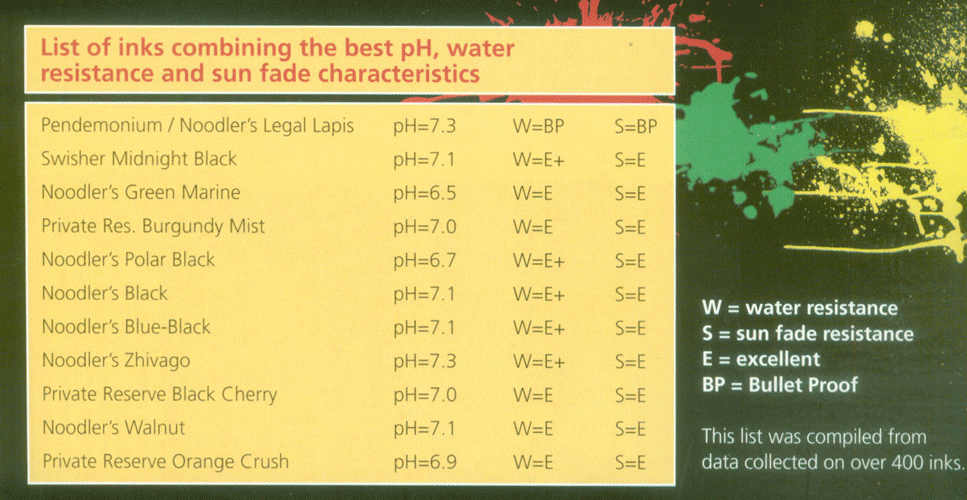
Information on this chart compiled by Greg Clark and published
in Stylus Magazine February - March 2008 issue.
Click image for larger version.Lexington Gray - A true gray, it does not look like a washed out black, there is a very, very slight hint of green that shows through.
Luxury Blue - A deep cobalt blue, with just a hint of fluorescence.
X-Feather Black - Bulletproof black ink does not feather, this makes it great for porous type papers such as copy paper, recycled papers and Moleskine notebooks. It is also a very slow drying ink and has limited penetration into the paper - this is what keeps it from feathering. Depends on what you want to trade off on .... no feathering or long dry time!
Noodler's Near - Bulletproof Inks
The Noodler's inks in the list below are what we term "Near-Bulletproof" Inks. If they get wet one dye component may wash out, but the bulletproof color they are mixed with will stay on the paper. An example would be Red-Black - when wet, the red washes away, but the black remains.
Aircorp Blue Black - Introduced in June 2004, this ink was made to replicate the old Aircorp color and is not your typical blue-black, it is dark and heavy with green tones.
Blue Black - Unlike some blue blacks, this has no grey tones and is a very stately deep, dark blue with a vintage look.
Golden Brown - Another Noodler's lighter brown color, heavy with yellow tones and very aptly named, it is indeed "golden brown" color.
Kiowa Pecan - A lighter brown, sort of resembling a golden caramel color.
Marine Green - Introduced in June 2004 as part of a patriotic set of inks, Marine Green is a very dark, forest type green. Not bright at all and a rich dark green quite appropriate for business correspondence.
Navy Blue - Introduced in June 2004 as part of a patriotic set of inks, the Navy Blue is not a dark navy as we think of the color navy blue, but the US Navy shade of blue. Lighter than midnight blue colors, green tones.
Red Black - A deep black with just a hint of red, color varies depending on how the light hits it. This qualifies as a semi-permanent ink. If exposed to water, the red will wash away, but the black remains permanent on paper.
Standard Brown - A dark chocolatey brown, a little lighter than Waterman Havana brown.
Walnut - Very, very dark and can appear almost black used in finer point pens.
Zhivago - At first glance, Zhivago might look black, but on closer inspection you will detect hints of dark green.
Noodler's Bay State InksNoodler's Bay State series of inks has high staining properties. We have posted multiple notices about the staining issue here as well as on several online pen forums and many to you via email as well. The colors are brilliant, but they will stain your pens, sink, hands, clothes and just about everything else it touches! People continue to buy the ink without reading the warnings and then are shocked by the staining.
Because of the controversy surrounding the Bay State series of inks, we have opted to discontinue them from our Noodler's offerings.
Note: We have no bottles of Parker's boo-boo ink, Penman, we never did and never will! You don't even want to email me about Penman ink, because I'll give you a big long lecture on how it stains, clogs and the best place for it is straight down the loo.
Quink Ink has been made since 1931, great all around ink. Tends to run a bit on the thin side as inks go, but not as thin as Sheaffer.
Black - I give it an 8 out of 10 on the dark black scale.
Blue - Medium blue, one of the safest inks around.
Blue-Black - Bit darker than Sheaffer blue-black, but without the grey tones, more blue than it is black.
Green - Bright green, similar to the Waterman green.
Red - Bright, true red - perfect for those "red" holidays!
Pelikan's ink colors are deep, rich colors. Pelikan ink is a bit "thicker" than some. Of note: Cross FP ink is made by Pelikan and is the same exact ink as the 4001 Pelikan ink. Pelikan is one of the few companies still packing ink in large bottles, so if you like Brilliant Black or Royal Blue a lot, you can buy it by the litre or in a large 250ml bottle.
Blue-Black - This blue-black also has some grey tones in it. Discontinued by Pelikan in early 2012.
Brilliant Black - This ties with Noodler's and Aurora black for the deepest, darkest, most opaque black fountain pen ink made today.
Brilliant Brown - This brown is an all around favorite, lots of coppery highlights, not like any other brown made today.
Brilliant Green - Bright green, think holiday green, a favorite for St Patrick's Day and Christmas.
Brilliant Red - This red leans toward the orangey side, not quite a mercurochrome color, but coming close.
Fount India - An exceptionally water resistant ink, great for addressing envelopes.
Royal Blue - In early 2005 Pelikan changed the color formula of Royal Blue in bottles and cartridges to a more vibrant blue. For years, Pelikan Royal Blue had been your typical nice German blue, just not very vibrant.
Turquoise - Deep turquoise.
Violet - Very rich deep violet color, more purple than blue.
Does it Work With Other Inks?
Many of you have asked if the Pelikan Super Pirat Ink Eradiator will work with other inks. We ran some random tests with one of the Super Pirats on a bunch of different brands and colors of inks. Basically, it works everytime with Pelikan Royal Blue ink which is it's intended use, the white end erases and the blue end to fill in your error is a color match to the Pelikan Royal Blue.In general, we found the Super Pirat does nothing on blacks and greys. On some other brands of blues, it will eradicate, but on others it turns the blue pink! Most greens it will do nothing. On some purples and violets, it will lighten the color or add a red stripe! It tends to lighten reds. Does nothing on browns, yellows or oranges. Your tests may differ because we couldn't try every single ink color made.
In a nutshell - the Super Pirat ink eradiator works well with Pelikan Royal Blue and not very well with other brands and colors.
Please note that the Super Pirat does NOT remove ballpoint, marker, roller ball, gel or any other inks that we have found from paper.Sorry, the SuperPirat is no longer available for sale.
Platinum Ink
Black - As one would expect from a Japanese black ink, the black is very dark. Not as saturated as some, but a strong black.
Carbon Black - Exceptionally dark, opaque black ink. perhaps the blackest ink available! However, you need to tend to pay close attention to cleaning your pen regularly if you use this ink. Carbon Black contains fine particulate carbon which can build up a little with time. It won't harm your fountain pens, but, it can restrict flow. Remember to clean your pens a little more often when using the Carbon Black ink! Carbon black is more permanent than most inks and a good choice for addressing envelopes. No longer sold in the US!
Blue Black - Not a traditional blue black with two tone type affects, but a dark blue. Not as deep as what we generally think of as Navy Blue, no confusing it with black in low light.
Red - A bright red, I tend to think of it as Mercurochrome red with that orangey-red look with a little pink mixed in. This color stands out!
Private Reserve inks are made in Zionsville, Indiana. Very bright, vibrant colors. Smooth flowing. A few people have mentioned that certain colors have a long dry time, but we have not experienced any extraordinary drying times. We all give a little tip of the hat to the folks at Private Reserve to be bold enough to introduce some great ink colors to the world of fountain pen users - a tiny group when looking at the big picture of pen sales these days.
American Blue - As of this writing, this is it! If you want a bright, beautiful true blue, we suggest American Blue. Comes the closest we've seen to the discontinued Penman Sapphire without any of the staining and clogging problems.
Arabian Rose - A dark rose color, not pastel pink, not magenta, but a beautiful easy on the eyes soft rose.
Avacado - As the name says, think avocado - not the inside pale green, but the outer dark skin green.
Black Cherry - A muddy brownish-red, just like the outside of a black cherry.
Black Magic Blue - This is an unusual blue, very deep blue, not quite midnight blue but varies in color depending on how the light hits it.
Blue Suede - A nice teal color which is very popular. Unless you get into mixing inks, this is the only teal currently being made. Much darker than the turquoise hues.
Burgundy Mist - A nice burgundy, not quite as purple as the old Sheaffer burgundy. Burgundy Mist has a bit more red than purple tones in it.
Buttercup - Bright shade of yellow, much more opaque than Herbin's Jaune Bouton d'Or. Still a light colored ink and I'd advise to use in broad pointed pens on very white paper.
Chocolat - Rich chocolate brown, just in between dark and milk chocolate!
Copper Burst - Medium shade of brown with nice copper highlights. Similar in color to the Pelikan Brilliant brown, but a bit less on the reddish side.
Dakota Red - Bright, bright pure red! Makes a good Christmas and Valentine's Day red.
Daphne Blue - Light turquoise. A few people have told me they think this is a good match for the discontinued Peacock Blue, but I find that while definitely turquoise, it's heavier on the blue and lighter than turquoise.
Ebony Blue - (introduced April 2008) A dark blue, still obviously blue, not black and not a blue-black either! There is a very slight hint of green in this color, but very, very little.
Ebony Green - (introduced April 2008) Very dark green, darker than PR's Sherwood, this would be a good conservative signature color.
Ebony Purple - (introduced April 2008) Deep, dark purple, in fact one of the darkest purples we've seen to date.
Fiesta Red - Deep blood red color, very close to OMAS Vespucci Red. This is a very popular red! Not too bright and not too dark.
Foam Green - From Private Reserve's pastel series of inks - soft pastel green.
Gray Flannel - Medium shade of gray, think gray flannel! Darker than Herbin's Grise Nuage, but lighter than Sheaffer's grey.
Lake Placid Blue - The truest, most vivid blue available. For those of you who liked the Parker Penman Sapphire or OMAS Roma 2000, you'll find Lake Placid Blue very similar in color, just a bit lighter.
Midnight Blues - Navy blue, very dark but remaining blue instead of falling into the blue-black range.
Orange Crush - Great shade of pumpkin orange, a bit more subdued than Herbin's Orange Indien. Perfect Fall color!
Naples Blue - Dark turquoise, not quite teal, but not as bright a turquoise as the Pelikan or J. Herbin.
Plum - Nice purple color with more red tones than most purples.
Purple Haze - Translucent purple, it's pastel but still purple (not lavender).
Purple Mojo - Vivid royal purple, just a tiny hint of red, but a pretty pure purple. Nice addition to Private Reserve's other purple hues.
Rose Rage - Rose Rage is a very deep and true pink, nothing wimpy about it. It's not what I'd call Hot Pink because not oodles of red in it, but is a bright pink.
Sepia - Sepia seems to vary a bit in color depending on the paper you're writing on. I've made numerous swashes of this color and it will range for a very yellow-ish brown to a nice milk chocolate type of brown. Qualifies as one of those two-tone type inks that show a range of color when used with flexible or italic nibs.
Shell Pink - From Private Reserve's pastel series of inks - a soft pink, yes it looks like the inside of a conch shell.
Sherwood Green - Wonderful shade of deep Hunter Green, or perhaps you might call it Forest Green, regardless there is not another dark green made by other manufacturers that comes close.
Shoreline Gold - This color is a very close match to the discontinued Sheaffer Kings Gold.
Sonic Blue - I think of this as slate blue, a blue-grey color with heavy grey tones.
Spearmint - Darker than most of the "holiday green" shades, but lighter than Private Reserve's Sherwood. Very close in color to the discontinued Parker Penman Emerald Green.
Tanzanite - Deep, deep blue with a hint of violet. A good all around blue that you just can't go wrong with.
Tropical Blue - A gorgeous deep aquamarine, not turquoise, a pure blue. Those of you who are fans of the sold out Limited Edition Diamine Tropical Blue will love this ink!
We've had so many queries if Private Reserve Tropical Blue is really the same as the long ago sold out and beloved Diamine Limited Edition Tropical Blue, that we swashed - THEY ARE IDENTICAL!
Ultra Black - Instant drying ink, and it does dry fast! Perfect for left handed writing. As is typical with fast drying ink, it tends to feather a bit more on cheap paper - that ink has to go somewhere, and the paper absorbs it!
Velvet Black - Deep, dark black - I'd rank it a 9 out of 10 on the blackness scale.
Washington DC SuperShow Blue - A deep cobalt blue that really makes a statement! Hightly saturated blue that is just barely a shade brighter than Private Reserve's American Blue. This ink started life in 2003 as a Special Edition ink produced only once a year in conjunction with the Washington DC Fountain Pen SuperShow. Bottles produced in 2003, 2004 and 2005 were marked with the date. Due to overwhelming popularity, Private Reserve removed the date from the name and started offering this ink on an ongoing basis in 2006.
Washington DC SuperShow Electric Blue - Introduced for the 2007 show, this is a rich cobalt blue with some bright undertones that really make it pop out on the page. Electric Blue was the perfect name choice for this one - it stands out!
Washington DC SuperShow Green - Introduced for the 2006 Washington DC Fountain Pen SuperShow. The new green is what I would call a mid-range green, it isn't bright and brash like Pelikan green, not dark and subdued like the Private Reserve Sherwood Green - it is in between! And it has clarity to it, it's the only way I can think to describe it, sort of a pure green.
Rohrer & Klingner Ink
Rohrer & Klingner Inks are made in Germany and became available in the US in 2006. The colors are very saturated and very smooth to write with - think Aurora silky smooth as a 10 in the world of smooth inks, R&K comes in at 9 and a very close second in the smooth department.
Alt Bordeaux (Old Bordeaux) - If you liked the old Sheaffer Burgundy, then you'll like Alt Bordeaux! Not too red, not too brown, just a beautiful shade of burgundy.
Alt-Goldgrün (Old Golden Green) - Another unusual color not quite like any other I've seen thus far. Sort of an olive green along the lines of J Hervin Vert Olive, but with a it more yellow in it.
Blau Permanent (Permanent Blue) - R&K's permanent blue ink is just a tad lighter in hue than the R&K Royal Blue. I haven't figured out why they call it permanent yet! I've run a bunch of water tests on this color, letting it sit for a few hours up to a few days and it acts as any traditional water base blue ink - it runs in water, washes away eventually leaving just a faint line. A nice blue, just not permanent!
Blu Mare (Sea Bluish) - Gorgeous turquoise! Not too blue, not too green, rich deep color.
Cassia - This is a neat color and I haven't found a close match to it made by anyone else yet! It is a very dark, deep purple, I like it, but then I am a big purple ink fan.
Fernambuk (Pernambuco) - Bright red with just a hint of orange, not as orangey as some German red inks though.
Helianthus (Sunflower) - Dark yellow, just a hint of orange. Yes, it looks like a sunflower and is much easier seen on paper than most yellow inks.
Königsblau (Royal Blue) - Fairly typical of German made Royal Blue inks which in American terms are not Royal Blue (bright blue) at all, but a nice shade of lighter than royal blue. If you've ever used vintage blue Skrip or Quink, this is reminiscent of those colors.
Leipziger Schwarz (Leipsician Black) - I like this for it's smooth black, but not quite as dark as Aurora or Noodler's black, down just a notch on the blackness scale!
Magenta - This is a darker magenta than most, starting to lean more toward than purple than pink.
Morinda - An unusual shade of red, with some dark undertones of pink, not much pink, but just enough so it is not a true red, not magenta, but ... Morinda - an unusual red.
Sepia - Sepia is an unusual shade of brown. Not your typical brown! Darker than what I normally think of as Sepia. Offers some nice shading effects. It is NOT a reddish-brown, has a hint of grey hiding in the background.
Smaragdgrün (Viridian Green) - Just a hint of blue in this ink, definitely does not make it turquoise, still very green. Color is very similar to J Herbin Vert Reseda, but a bit more saturated.
Solferino - Solferino reminds me of Waterman or Pelikan purple, think royal purple, more on the red than blue side of purple.
Verdigris - Definitely an antique look to Verdigris. Think of weathered green copper, but add in a little blue. Unusual color.
Verdura (Verdure) - Think holiday green, pure green, but with a soft look - it isn't as brash as some, it doesn't jump out at you quite as much as Waterman or Parker Quink greens.
Sailor Ink
Sailor inks are very smooth and silky (approaching Aurora smooth!) to write with. They have a few colors that are quite different from any others - Red-Brown and Yellow-Orange are neat colors and Yellow-Orange is easily read, unlike many yellow inks.
Black - Smooth, deep opaque black.
Blue - Dark royal blue, quite dignifed.
Blue-Black - Very deep, dark blue-black, you still see the blue, but darker than most blue-black inks.
Brown - Very dark chocolate brown, maybe we should call it coffee brown, it really is dark and rich.
Gray - Beautiful deep gray, not washed out black.
Green - Middle of the road green, not bright or brash, a little softer than Waterman or Parker green.
Red - Cartridges only - a bright, true red.
Red-Brown - Unusual color that is exactly as the name says, not brown, not red, but a rich blend of the two.
Yellow-Orange - A deep, dark yellow with a hint of orange that is easily seen by itself, unlike many of the yellow inks which really are only suitable for mixing or highlighting.
Sheaffer Skrip ink was first introduced in 1922, the formula has changed very little over the years. In 2002, Sheaffer began having their ink made in Slovenia and updated the bottle design. To date, all of the Slovenian Sheaffer inks have performed flawlessly and everyone has been pleased with the new colors.
Sheaffer inks are a "thinner" ink, some think the colors may be a bit more washed out than some of the more vibrant inks, but Sheaffer Blue is still one of our best selling inks! We've also found that the new purple is a very deep purple and not washed out at all.
Blue - Great medium blue color and an all time favorite.
Blue-Black - More on the blue than the black side of blue-black.
Brown - A nice deep brown color, not quite as chocolate-ly as Waterman Havana.
Burgundy - Nice rich true burgundy color, not red - not purple, this is my favorite burgundy. Discontinued in 2002
Green - Middle of the road green, tad toward the blue side, but definitely not turquoise.
Grey - Darker than some grey inks, leaning toward the black side of the ink rather than the white. Discontinued in 2002
Jet Black - I'd rank this black about a 7 out of 10 for deepest, most opaque black qualities. Tends to pick up some of those grey tones, especially in broader pens.
Kings Gold - I love this color, not your average fountain pen ink! Think light caramel color or ochre, dark enough to show up well, a nice autumn color. Discontinued in 2002
Lavender - Lovely shade of lavender - not purple, not violet, but a lighter hue, think pastel. Discontinued in 2002
Peacock Blue - One of Sheaffer's old standbys that many people remember using in school, a turquoise blue. Discontinued in 2002
Red - A nice bright holiday red. Good for your Valentines!
"New" Sheaffer Colors
Gold - This is not gold at all, but a very pretty lemon yellow.
Orange - Bright Halloween orange and a great autumn color.
Pink - Definitely not pastel pink, but not as bright as Herbin's Rose Cyclamen (magenta) ink either.
Purple - Deep royal purple, we like it a lot.
Turquoise - This is the replacement color for the old Peacock Blue. A tad darker than Peacock, but still definitely turquoise and still a customer favorite.
Stipula Ink
Stipula's Calamo inks come in large wide mouth 70cc bottles, making filling easy for large nibbed pens. Six unusual colors, these don't quite match up to anything we've seen yet!
Black - This is a rather fascinating shade of black! Doesn't fall into the range of blacks that are super dark and opaque. It is definitely black, but has a very subtle, very dark green undertone to it.
Dark Red (Borgogna) - Rather intriguing color, lots of depth and two-tone effects. It leans toward being a red-toned burgundy. Nothing typical bright red about it, darker and more conservative than most reds. More translucent than Private Reserve's Fiesta Red but in the same color range.
Deep Blue (Blu della Robbia) - Very dark slate blue, lots of grey in this, but still blue.
Florentine Red (Rosso Florentino) - Bright red, hints of pink in it, but not TOO pink!
Moss Green (Verde Muschiato) - Darker than the olive greens, a brownish-green.
Sapphron (Zafferano) - Yellow-orange color, leaning a bit more toward the orange tones but not a full fledged orange! Lots of two-tone type effects especially in broader nibbed pens. This is a lighter ink, but not so light that it is still easily seen when used in finer point pens, unlike some of the purer yellow inks.
Sepia (Terra di Siena) - Dark brown, picks up lots of two-tone effect.
Visconti Ink
Visconti Italian inks are lovely, good flow properties, nice colors, but perhaps best of all is their glass champagne style bottle allowing you to easily fill your fountain pens in the "stem" of the bottle.
Black - Not a super opaque black, but certainly not wimpy either!
Blue - Cobalt blue, good stand out color, but not too dense, a hint of translucency to this blue.
Bordeaux - Quite beautiful, a nice deep shade of burgundy with slight brown undertones.
Green - True green, but not overly bright.
Red (cartridges only) - For some reason unknown to me, Visconti put bright cherry red in their cartridges instead of the matching bottled Bordeaux. Good red for your Valentines!
Sepia - Medium brown with just a trace of copper highlights.
Turquoise - Visconti got the turquoise just right, not too green, more on the blue side.
Waterman inks are some of our customers' favorites. Rich colors, smooth flowing. Now being made in France.
Intense Black - Good deep black, I give it a nine out of ten of the dark black scale.
Mysterious Blue (was Blue-Black) - Waterman blue-black ink has a distinctive vintage look to it, lots of two tone affects of blue and black, plus a tiny hint of green. A favorite of many!
Serenity Blue (was Florida Blue) - One of our best selling blues, true blue and on the brighter side, not washed out at all.
Harmonious Green - Good mid-range green, a little brighter than the Pelikan Brilliant Green.
Absolute Brown (was Havana Brown) - Chocolate Brown, plain and simple. When someone asks for a dark true brown, Havana is what we suggest.
Tender Purple - Not too blue, not too red, a good true purple. When people ask us for a true purple, this is one of three that I recommend (the other two are Pelikan Purple and Herbin Violette Pensee) Waterman purple is one my personal favorites.
Audacious Red - a true bright red, not orangey and not pink-ish. Perfect for Valentine's Day and winter holidays!
Inspired Blue (was South Seas Blue) - The name says it all, a beautiful shade of turquoise.
Yard-o-Led Ink
Yard-o-Led inks are currently made by Diamine in England. We've listed below the names of the Yard-o-Led colors and their Diamine name to help you figure out which one is which since there are a lot more Diamine colors available than Yard-o-Led colors.
Also of note: Yard-o-Led Royal Blue changed color formulas around 2002. The older pre-2002 Yard-o-Led Blue is a match to Diamine Tropical Blue, a limited edition ink issued in 2004.
Yard-o-Led Ink Name
Blue Black.............................
Claret....................................
Jet Black...............................
Royal Blue (current)...............
Royal Blue (pre-2002 ish).....
Turquoise..............................Diamine Ink Name
Blue Black
Claret
Jet Black
Royal Blue
Tropical Blue
Turquoise
Ink Cartridges
Unraveling the Mystery!This section of our Ink Facts page is designed to help you figure out which cartridge will fit your pen. Remember that not all fountain pens take cartridges, some pens will fill from only from an ink bottle.
This list is by no means complete! If you have a pen not listed here that uses cartridges, drop us an email and let us know about it.
Standard International CartridgesStandard International Cartridges fit many, many fountain pens! Below is a list, but it is by no means conclusive and there are certain exceptions as noted below. Most, but not all European pens will use standard international cartridges.
Standard short international cartridges measure 1.5inches (39mm) in length. Outer dimension of nipple width is 4mm, the inner width is 3mm. The diameter of the closed end of cartridge is 7mm. You may find slightly different tolerances among the different brands, but all are VERY close to these dimensions.
Many fountain pens that use standard short international cartridges will allow you to "piggyback" two cartridges in the barrel. This means you insert one cartridge into the nib/feed unit to use. The second cartridge is inserted nipple end down into the barrel so that the two flat closed ends of the cartridges flush up next to each other. Now you have a spare cartridge!
Acme
Ancora
Bexley
Bosserrt & Erhard
Caran d'Ache
Cartier
Colibri
Conklin
Conway Stewart
DaniTrio
Daniel Hechter
David Oscarson
Delta
Diplomat (newer Diplomats use standard international short cartridges, some older Diplomats used proprietary cartridges)
Dunhill (most Dunhills use standard international short cartridges. Dunhill AD series uses Pilot/Namiki cartridges)
Elysee
Faber Castell
Inoxcrom
Itoya
Jean Pierre Lepine
Jorg Hysek
Kaweco
Krone
Lalex
Libelle
Lominchay
Marlen
Michel Perchin
Montblanc (International cartridges will fit *most* MB pens, there are a few, that will use only Montblanc cartridges which have just a slightly different profile)
Montegrappa
Monteverde
Nettuno
Northpointe
OMAS
Osmiroid
Pelikan
Recife
Reform
Retro 51
Rotring
Schmidt
Schneider
Sensa
Sheaffer - Reacktor FP (the ONLY Sheaffer that does NOT use Sheaffer cartridges!)
Signum
S.T. Dupont
Stipula
Stypen
Taccia
Tombow
Underwood
Visconti
Waterford
Waterman (Recent Watermans (starting around 2004) have a brass sleeve inserted into the barrel that prevents some international cartridges from fitting properly)
Yard o Led
Proprietary CartridgesThese companies make pens that will ONLY take their cartridges, no others will fit, they are proprietary cartridges. Once in awhile, people get in a pinch and try to SHOVE a different cartridge into one of these pens. It might work, but be forewarned, you're just asking for a leaky cartridge, or even possible damage to your pen.
AT Cross
Lamy
Pilot/Namiki
Platinum
Sailor
Sheaffer (except Reacktor which uses Std Short International size)
Sheaffer Slim Cartridge II (Specs: Length: 64.5mm; Insertion end: 3.85mm; Barrel end: 6.5mm)
Other Cartridge InformationAurora uses Aurora OR Parker cartridges
Fultz uses Parker OR Aurora cartridges
Parker uses Parker OR Aurora cartridges
Nakaya uses Platinum cartridges
©Copyright 1995-2015
Pendemonium
All Rights Reserved.
